Adult vs Newborn Size (Graphing)
Larger organisms have larger offspring. We want to explore the form of this relationship in mammals.
Check to see if Mammal_lifehistories_v2.txt is in your working directory.
If not download it it to your data/ folder. If the above link doesn’t work, you can find the data on the datasets page under Mammal life history.
Missing data in this file is specified by -999 and -999.00. Tell R that
these are null values using the optional read.csv() argument,
na.strings = c("-999", "-999.00"). This will stop them from being plotted.
To read in the data, run the following command:
mammal_histories <- read.csv("data/Mammal_lifehistories_v2.csv",
          na.strings = c("-999", "-999.00"))
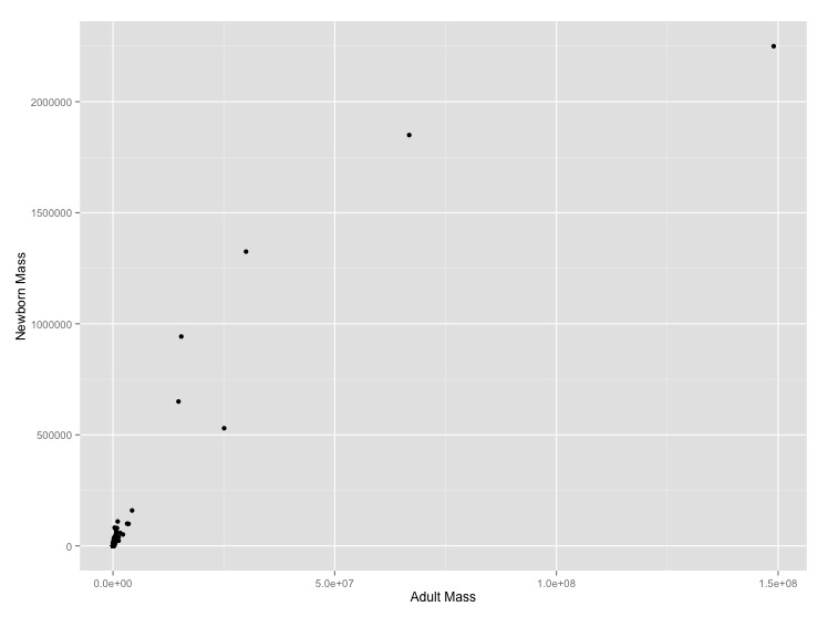
- Graph adult mass vs. newborn mass. Label the axes with clearer labels than the column names.
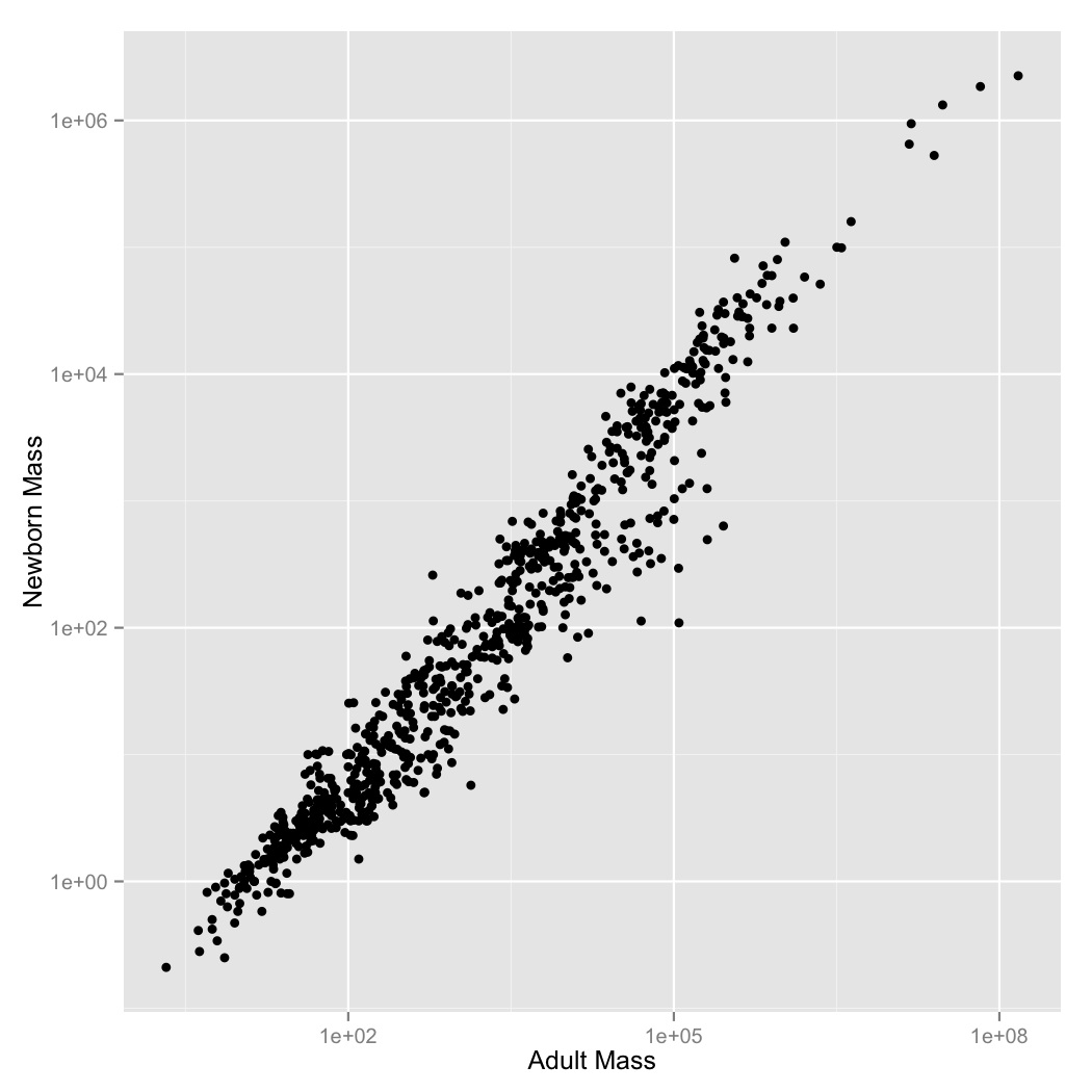
- It looks like there’s a regular pattern here, but it’s definitely not linear. Let’s see if log-transformation straightens it out. Graph adult mass vs. newborn mass, with both axes scaled logarithmically. Label the axes.
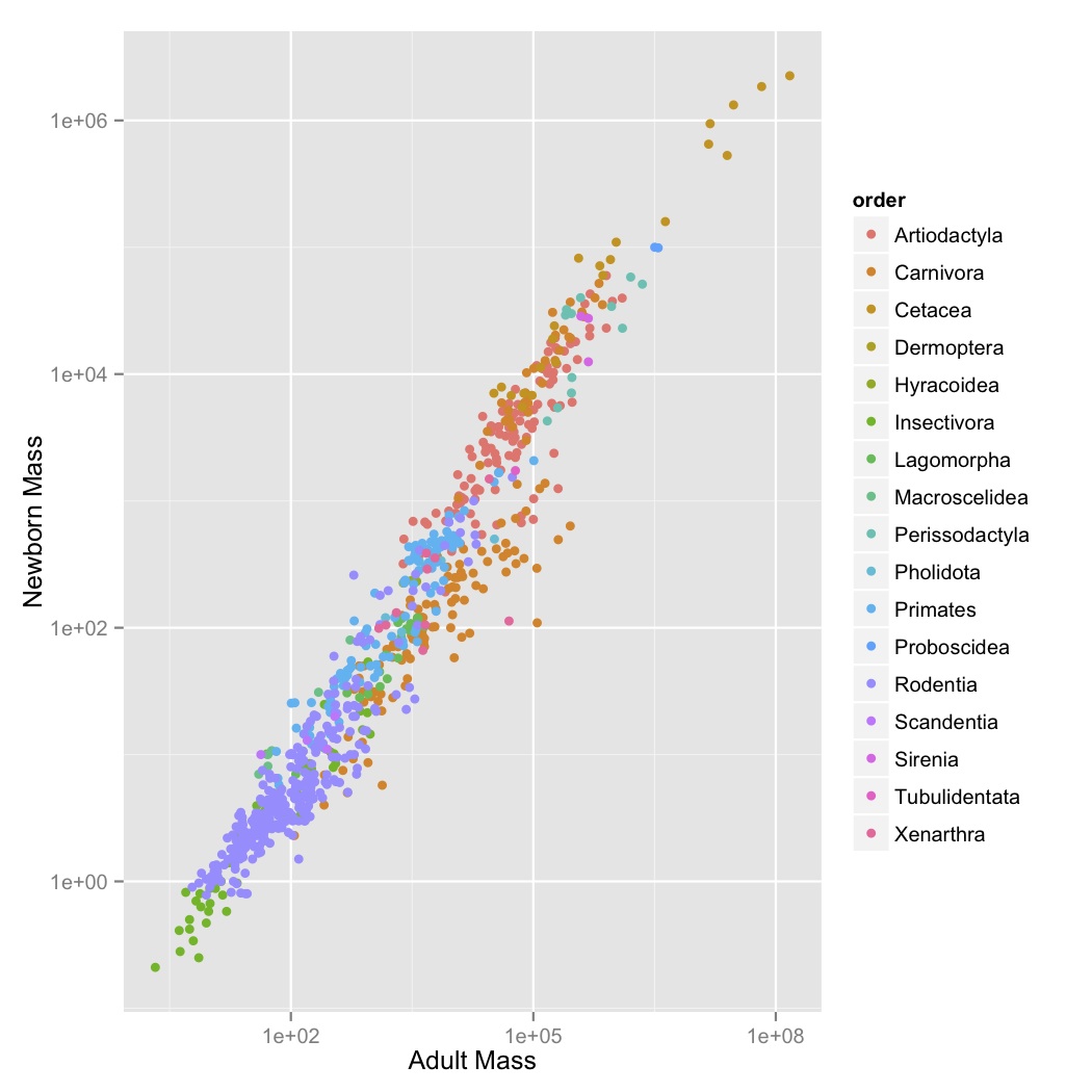
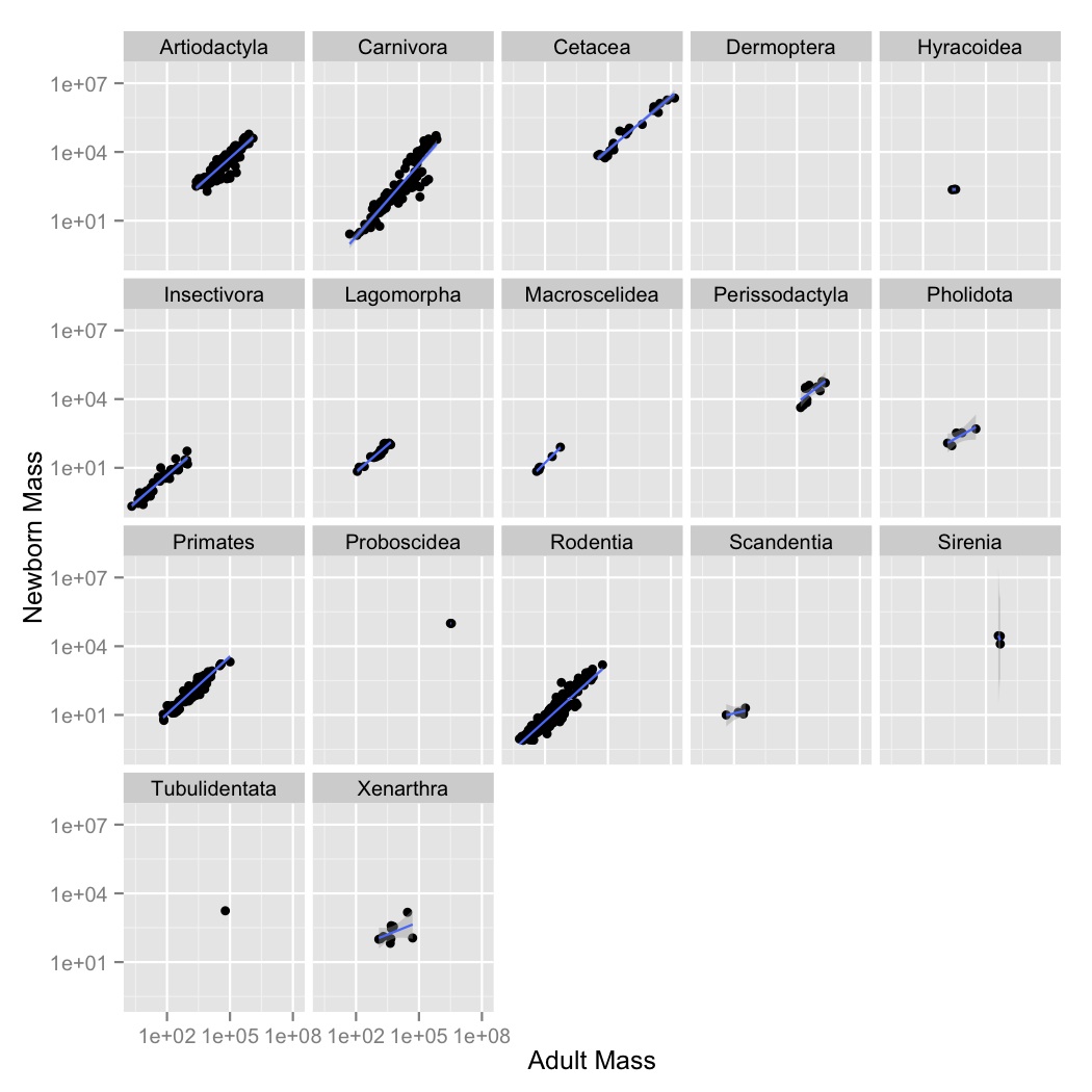
- This looks like a pretty regular pattern, so you wonder if it varies among different groups. Graph adult mass vs. newborn mass, with both axes scaled logarithmically, and the data points colored by order. Label the axes.
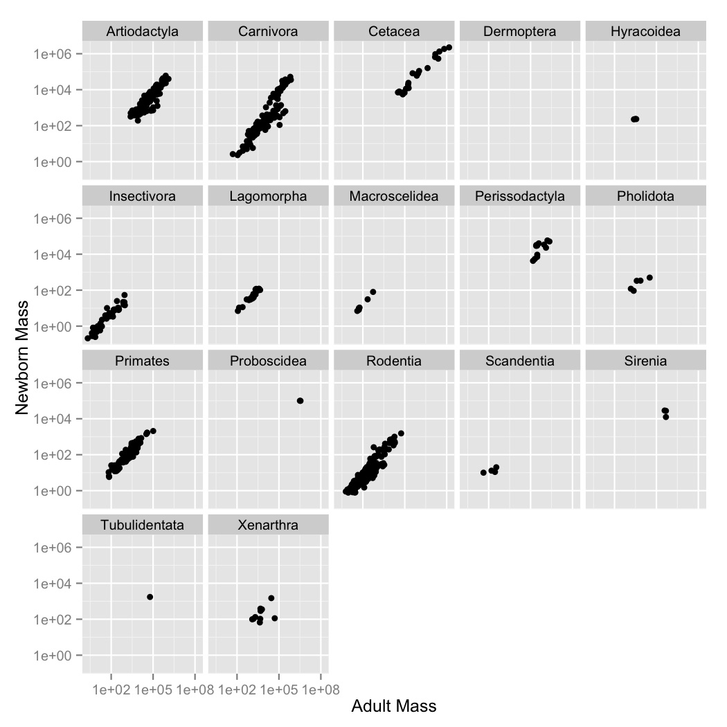
- Coloring the points was useful, but there are a lot of points and it’s kind
of hard to see what’s going on with all of the orders. Use
facet_wrapto create a subplot for each order. - Now let’s visualize the relationships between the variables using a simple
linear model. Create a new graph like your faceted plot, but using
geom_smoothto fit a linear model to each order. You can do this using the optional argumentmethod = "lm"ingeom_smooth.