Learning Objectives
Following this assignment students should be able to:
- understand the basic plot function of
ggplot2- import ‘messy’ data with missing values and extra lines
- execute and visualize a regression analysis
Reading
-
Topics
ggplot
-
Readings
-
Additional information
Lecture Notes
Place this code at the start of the assignment to load all the required packages.
library(dplyr)
library(ggplot2)
library(readr)
Exercises
Acacia and Ants (20 pts)
An experiment in Kenya has been exploring the influence of large herbivores on plants.
Check to see if
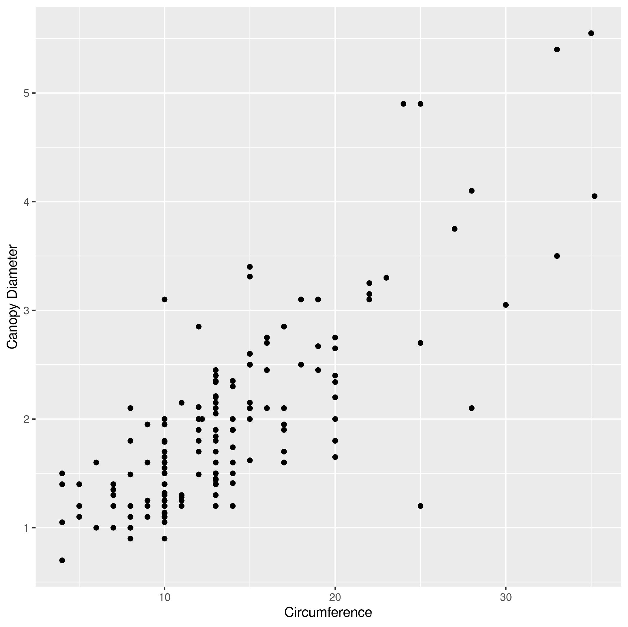
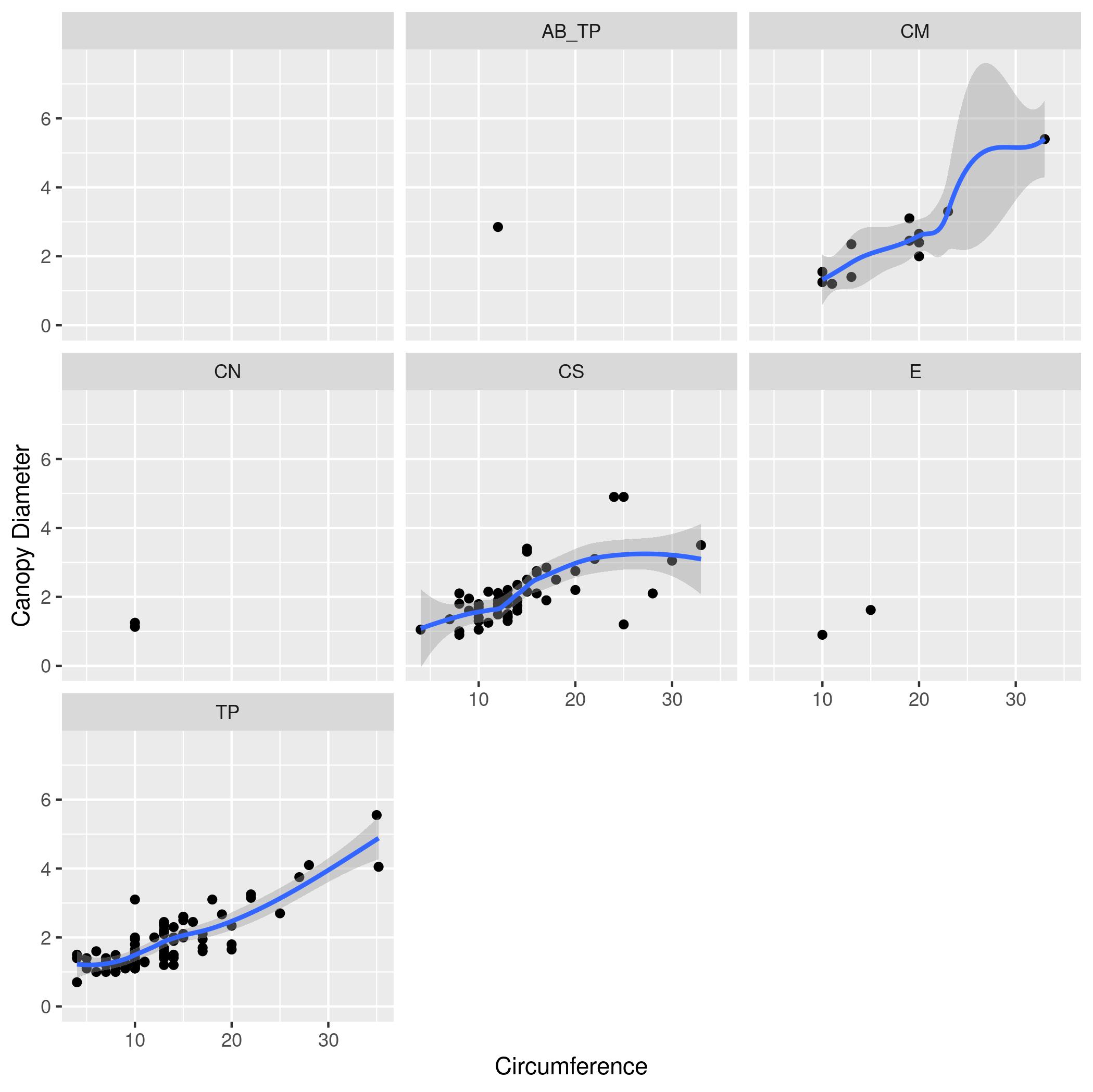
ACACIA_DREPANOLOBIUM_SURVEY.txtis in your workspace. If not, download it. Read it into R using the following command:acacia <- read.csv("ACACIA_DREPANOLOBIUM_SURVEY.txt", sep="\t", na.strings = c("dead"))- Make a scatter plot with
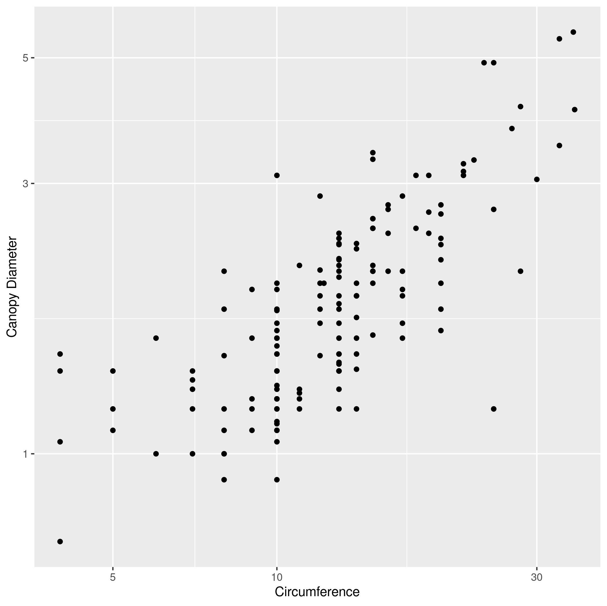
CIRCon the x axis andAXIS1(the maximum canopy width) on the y axis. Label the x axis “Circumference” and the y axis “Canopy Diameter”. - The same plot as (1), but with both axes scaled logarithmically (using
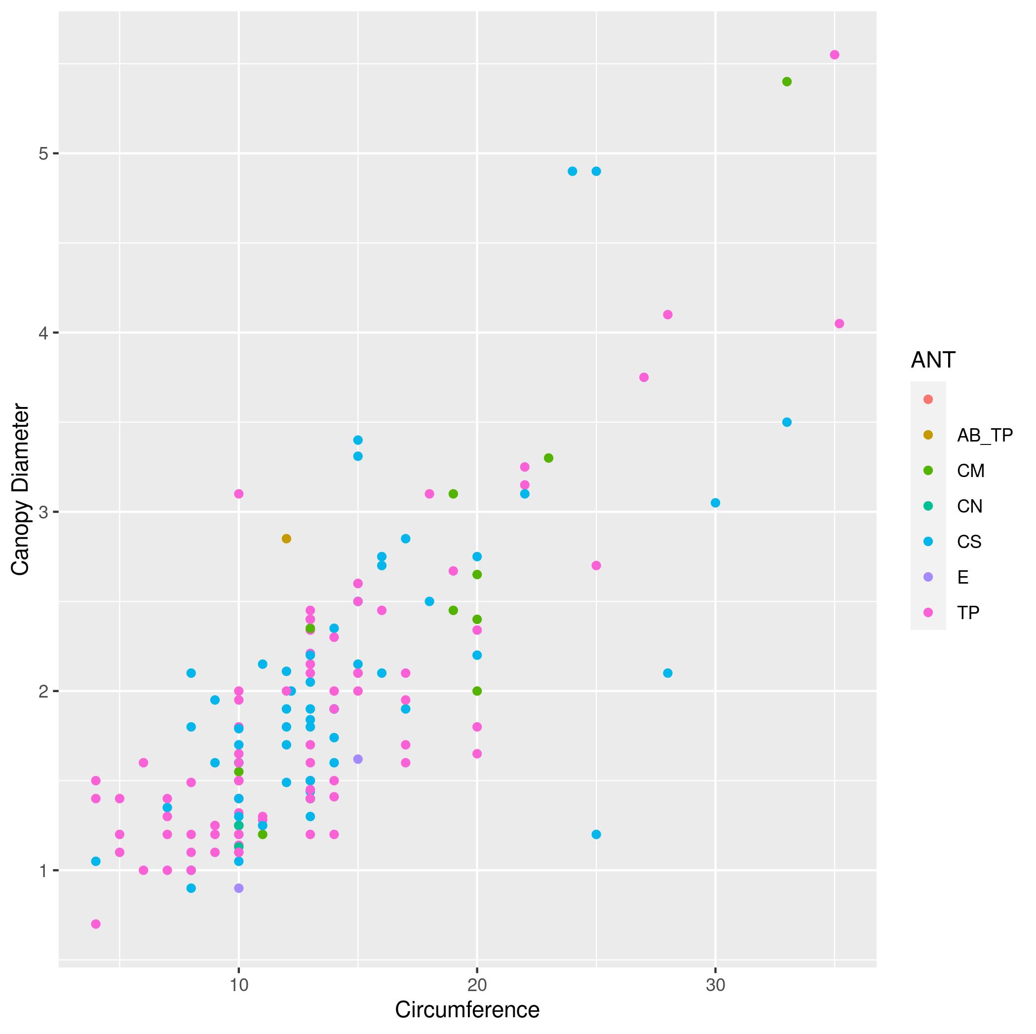
scale_x_log10andscale_y_log10). - The same plot as (1), but with points colored based on the
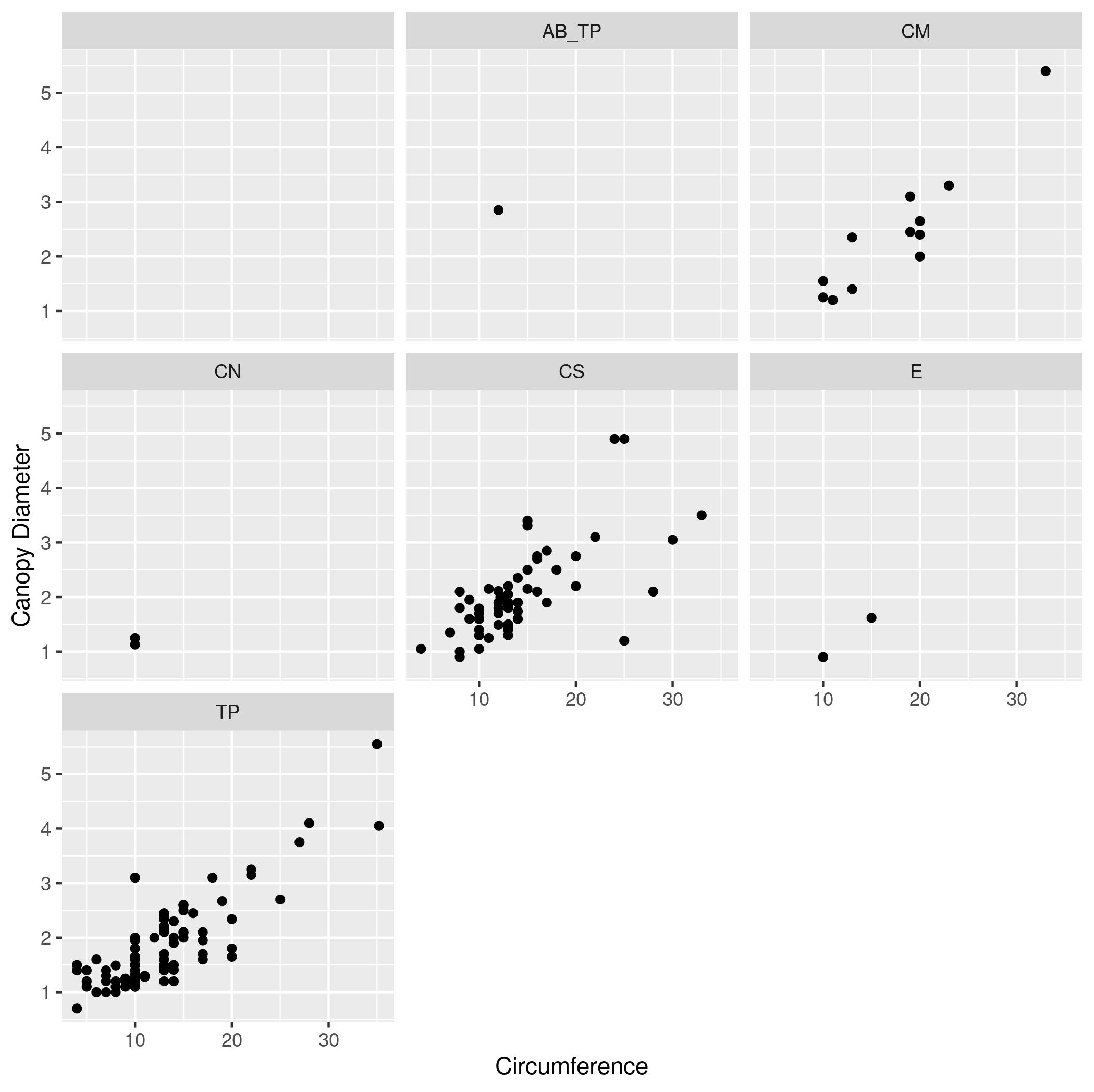
ANTcolumn (the species of ant symbiont living with the acacia) - The same plot as (3)), but instead of different colors show different species of ant (values of
ANT) each in a separate subplot. - The same plot as (4) but add a simple model of the data by adding
geom_smooth.
- Make a scatter plot with
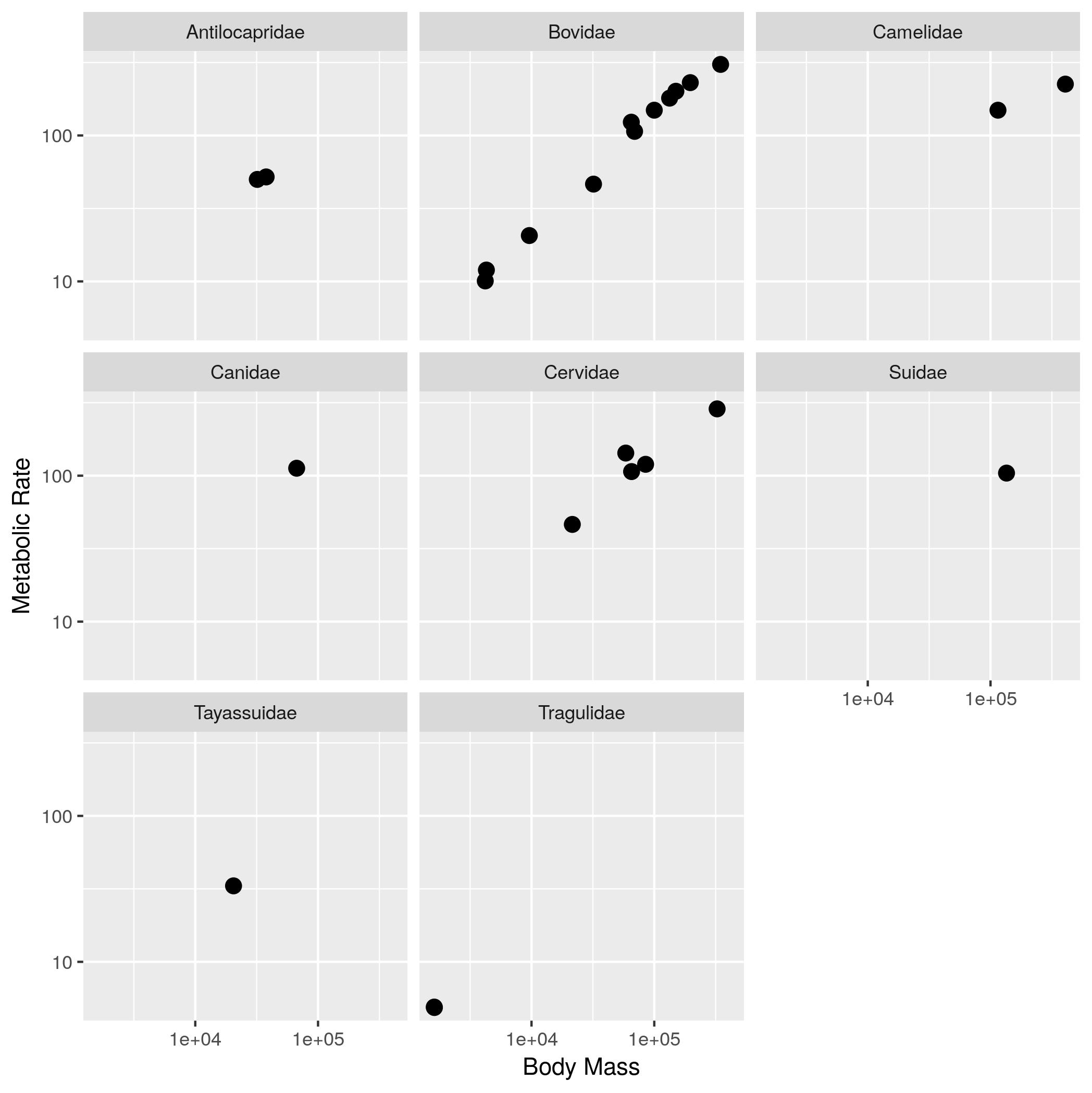
Mass vs Metabolism (20 pts)
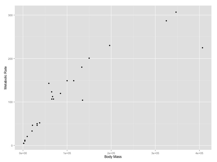
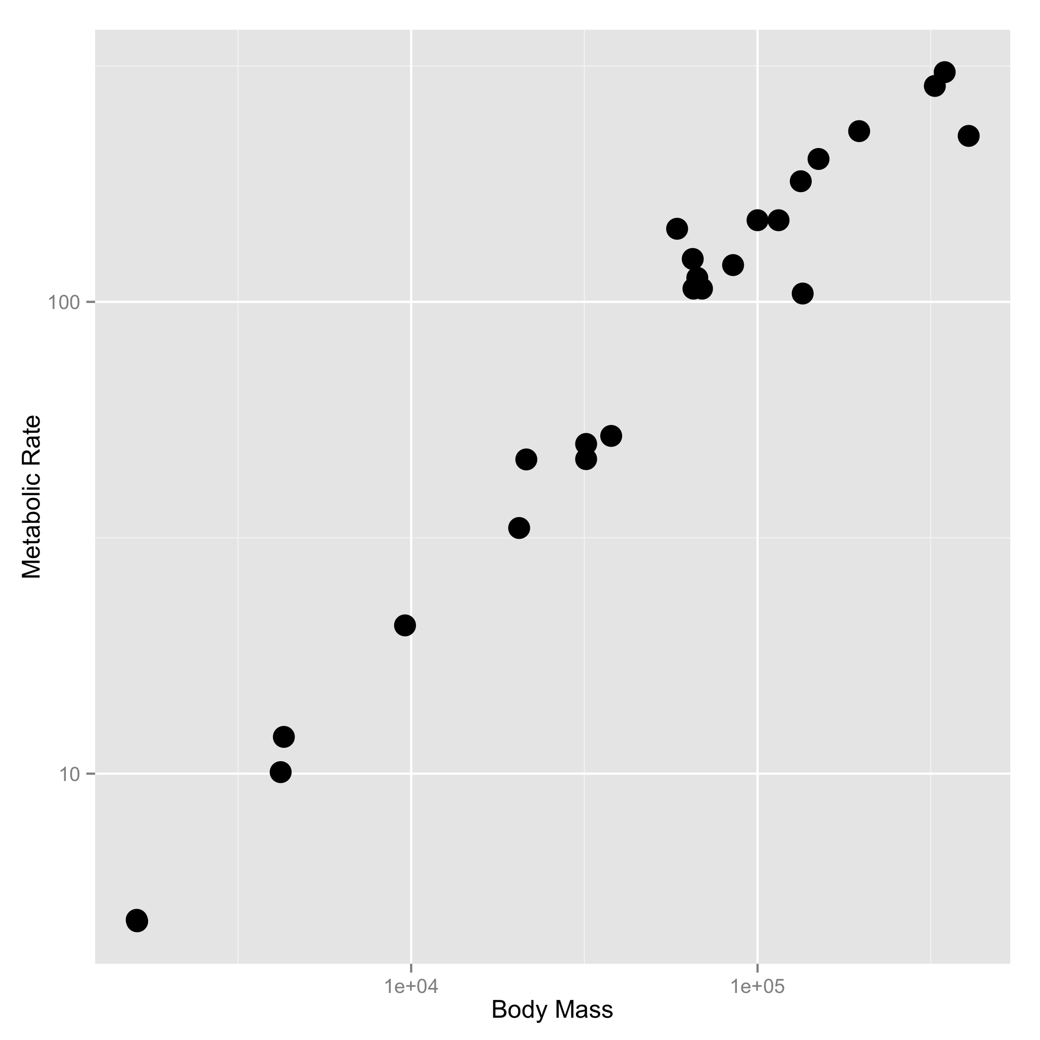
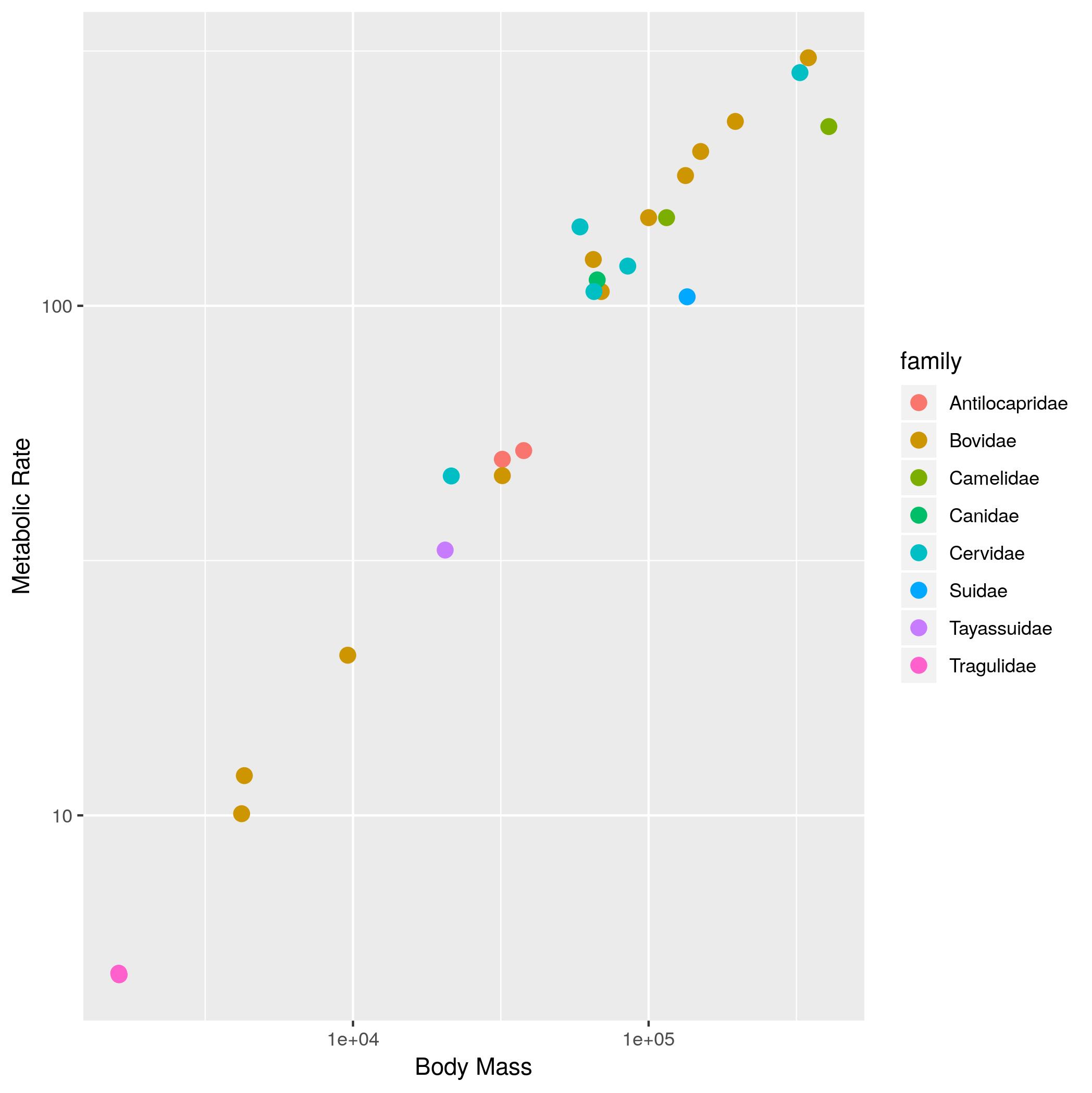
The relationship between the body size of an organism and its metabolic rate is one of the most well studied and still most controversial areas of organismal physiology. We want to graph this relationship in the Artiodactyla using a subset of data from a large compilation of body size data (Savage et al. 2004). You can copy and paste this data frame into your program:
size_mr_data <- data.frame(
  body_mass = c(32000, 37800, 347000, 4200, 196500, 100000,
    4290, 32000, 65000, 69125, 9600, 133300, 150000, 407000,
    115000, 67000,325000, 21500, 58588, 65320, 85000, 135000,
    20500, 1613, 1618),
  metabolic_rate = c(49.984, 51.981, 306.770, 10.075, 230.073,
    148.949, 11.966, 46.414, 123.287, 106.663, 20.619, 180.150,
    200.830, 224.779, 148.940, 112.430, 286.847, 46.347,
    142.863, 106.670, 119.660, 104.150, 33.165, 4.900, 4.865),
  family = c("Antilocapridae", "Antilocapridae", "Bovidae",
    "Bovidae", "Bovidae", "Bovidae", "Bovidae", "Bovidae",
    "Bovidae", "Bovidae", "Bovidae", "Bovidae", "Bovidae",
    "Camelidae", "Camelidae", "Canidae", "Cervidae",
    "Cervidae", "Cervidae", "Cervidae", "Cervidae", "Suidae",
    "Tayassuidae", "Tragulidae", "Tragulidae"))
Make the following plots with appropriate axis labels:
- A plot of body mass vs. metabolic rate
- A plot of body mass vs. metabolic rate, with log10 scaled axes (this stretches the axis, but keeps the numbers on the original scale), and the point size set to 3.
- The same plot as (2), but with the different families indicated using color.
- The same plot as (2), but with the different families each in their own subplot.
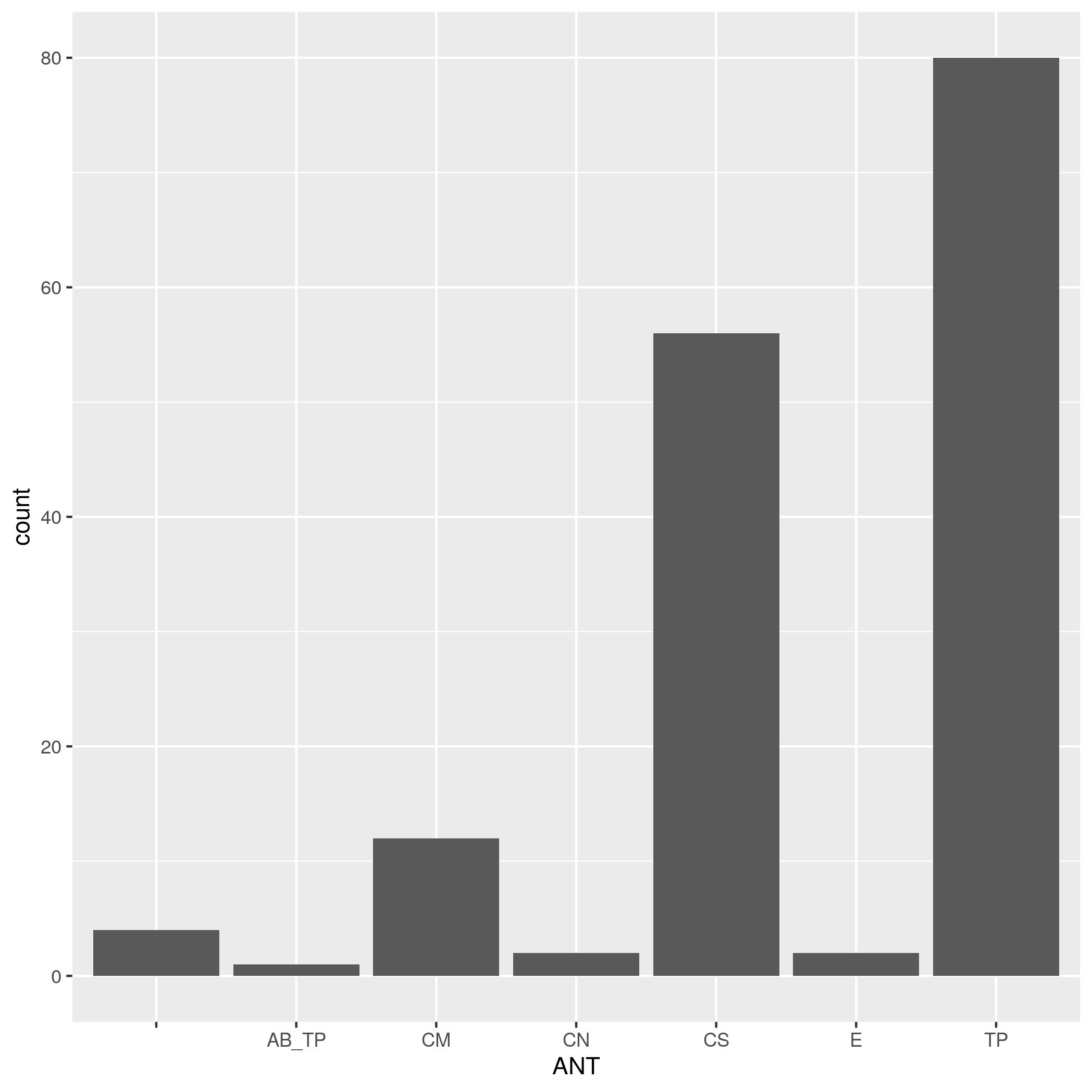
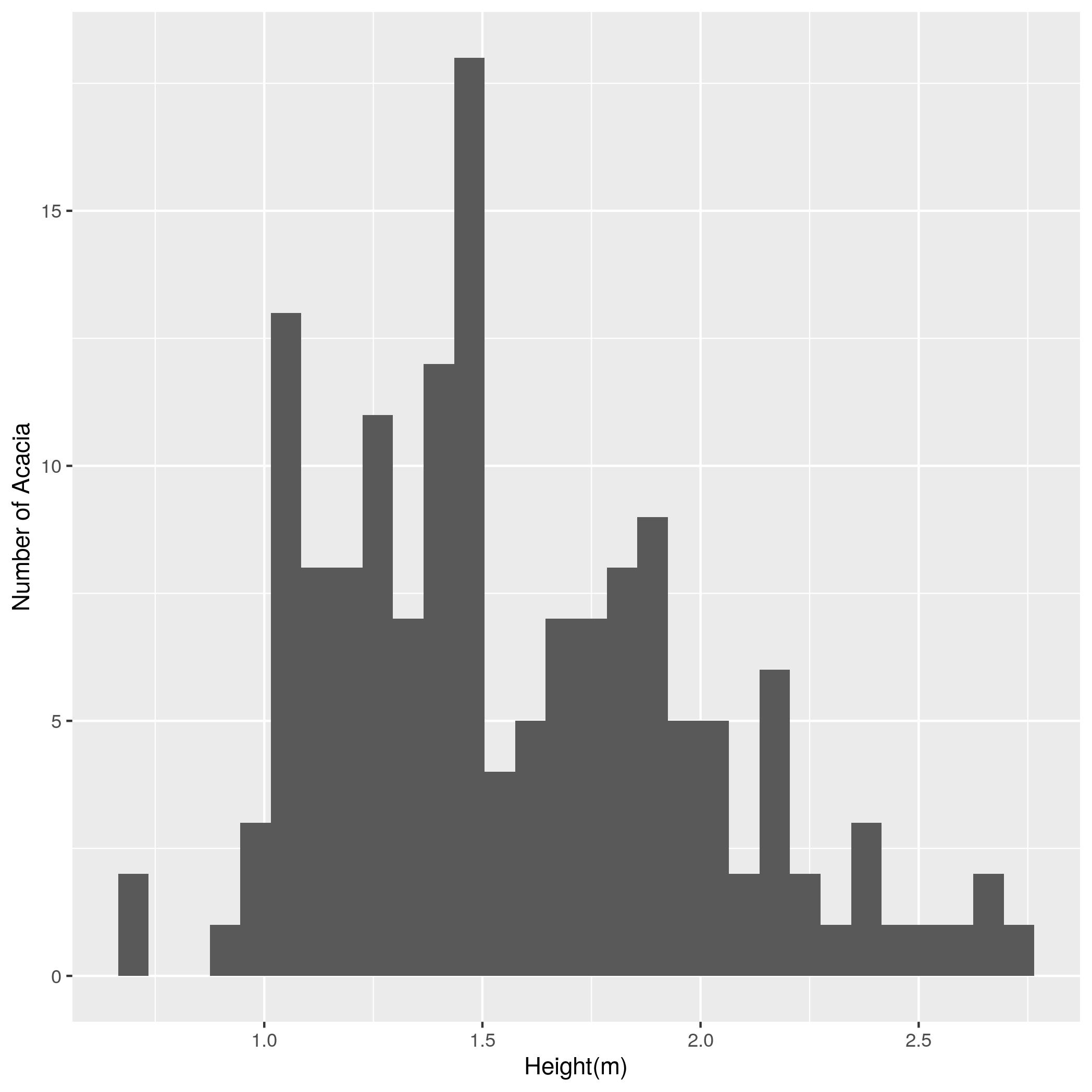
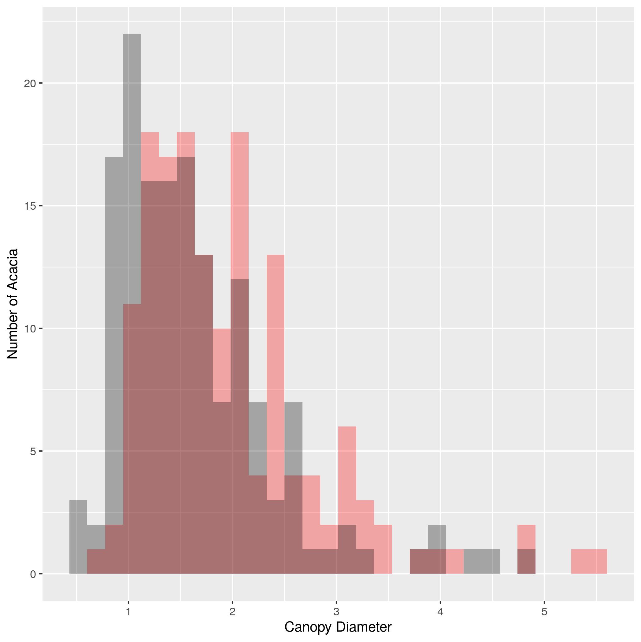
Acacia and Ants Histograms (20 pts)
An experiment in Kenya has been exploring the influence of large herbivores on plants.
Check to see if
ACACIA_DREPANOLOBIUM_SURVEY.txtis in your workspace. If not, download it. Read it into R using the following command:acacia <- read.csv("data/ACACIA_DREPANOLOBIUM_SURVEY.txt", sep="\t", na.strings = c("dead"))- Make a bar plot of the number of acacia with each mutualist ant species (using the
ANTcolumn). - Make a histogram of the height of acacia (using the
HEIGHTcolumn). Label the x axis “Height (m)” and the y axis “Number of Acacia”. - Make a plot that shows histograms of both
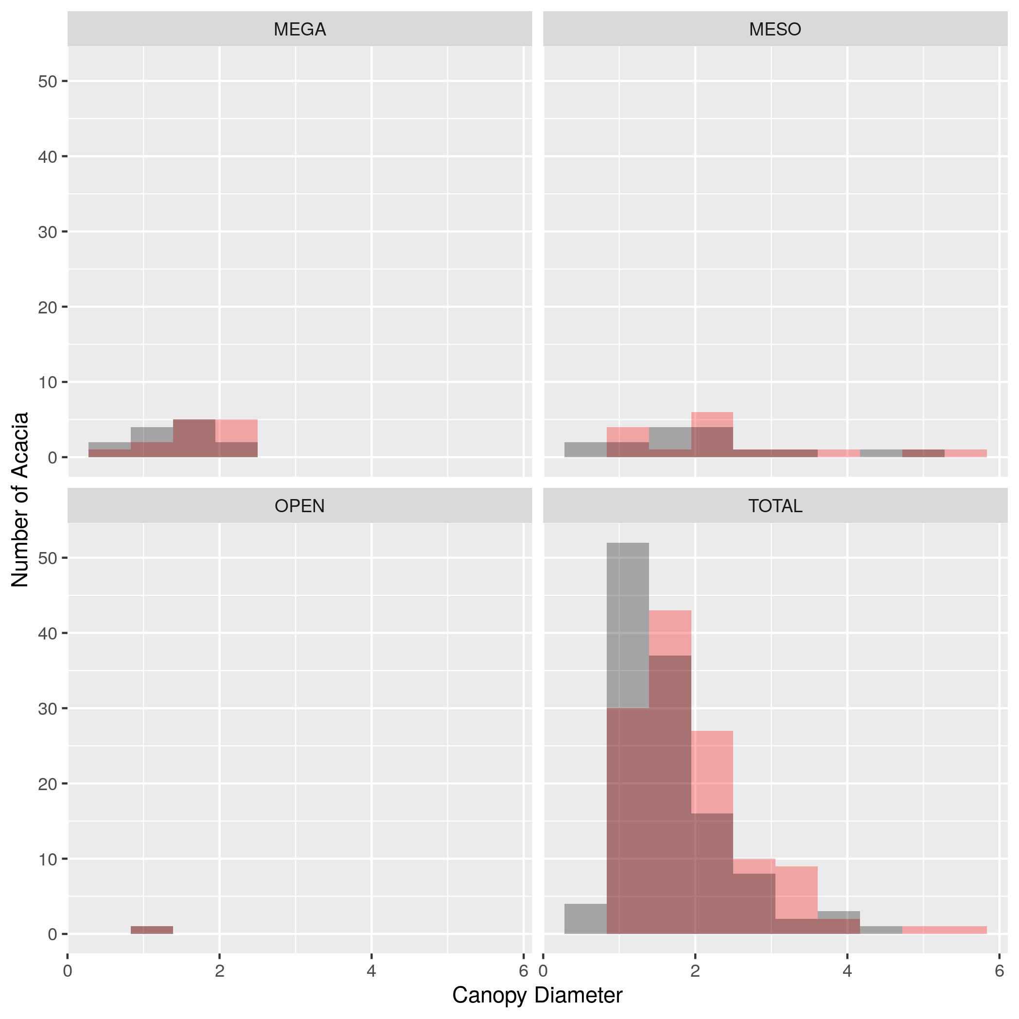
AXIS1andAXIS2. Due to the way the data is structured you’ll need to add a 2nd geom_histogram() layer that specifies a new aesthetic. To make it possible to see both sets of bars you’ll need to make them transparent with the optional argument alpha = 0.3. Set the color forAXIS1to “red” andAXIS2to “black” using thefillargument. Label the x axis “Canopy Diameter(m)” and the y axis “Number of Acacia”. - Use
facet_wrap()to make the same plot as (3) but with one subplot for each treatment. Set the number of bins in the histogram to 10.
- Make a bar plot of the number of acacia with each mutualist ant species (using the
Acacia and Ants Data Manipulation (20 pts)
An experiment in Kenya has been exploring the influence of large herbivores on plants.
Check to see if
TREE_SURVEYS.txtis in your workspace. If not, downloadTREE_SURVEYS.txt. Useread_tsvfrom thereadrpackage to read in the data using the following command:trees <- read_tsv("TREE_SURVEYS.txt", col_types = list(HEIGHT = col_double(), AXIS_2 = col_double()))- Update the
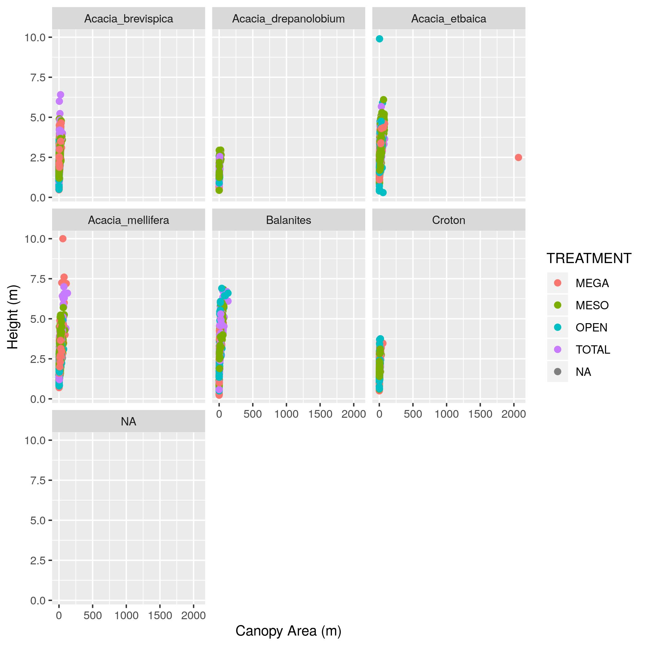
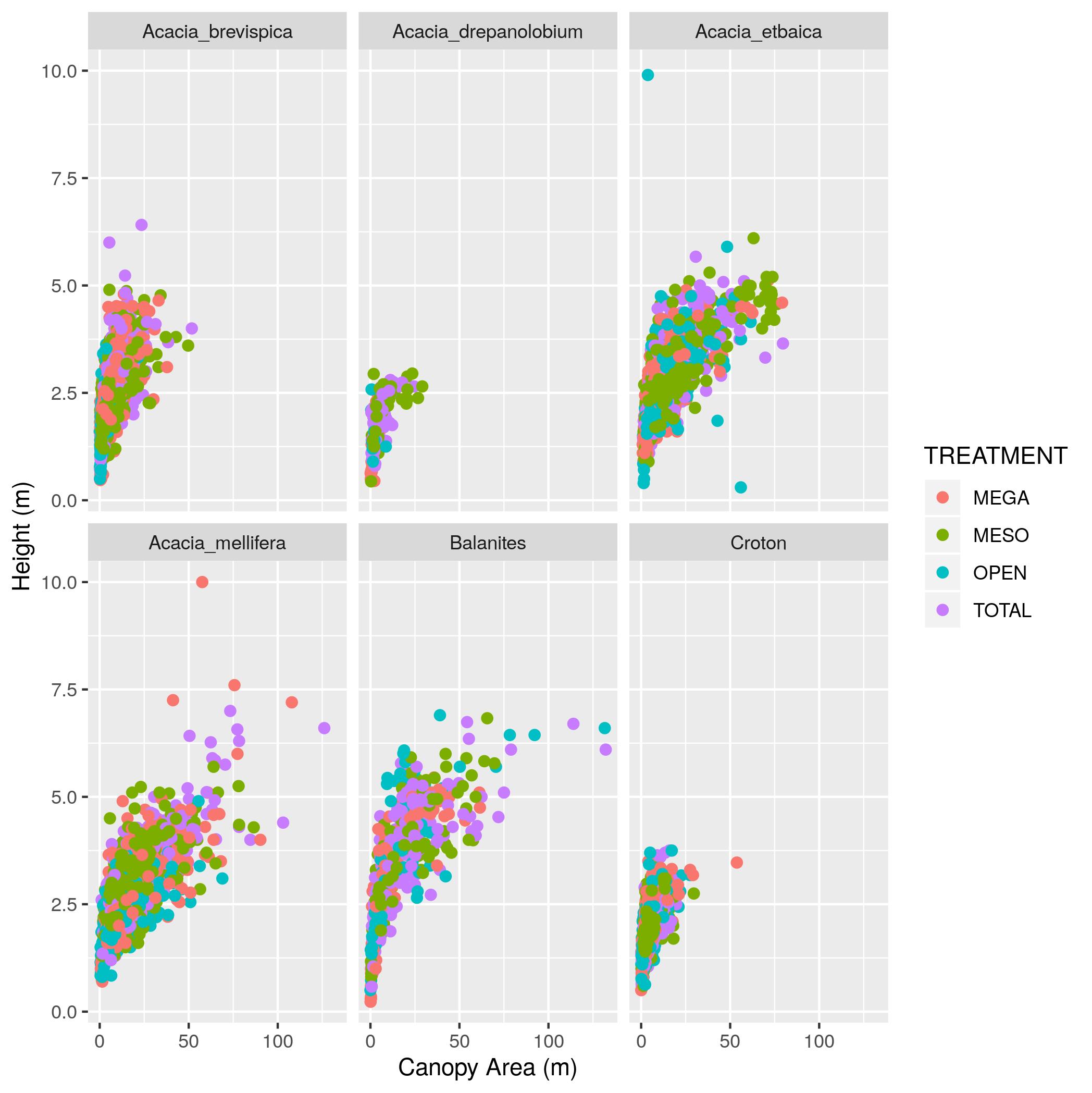
treesdata frame with a new column namedcanopy_areathat contains the estimated canopy area calculated as the value in theAXIS_1column times the value in theAXIS_2column. Show output of thetreesdata frame with just theSURVEY,YEAR,SITE, andcanopy_areacolumns. - Make a scatter plot with
canopy_areaon the x axis andHEIGHTon the y axis. Color the points byTREATMENTand plot the points for each value in theSPECIEScolumn in a separate subplot. Label the x axis “Canopy Area (m)” and the y axis “Height (m)”. Make the point size 2. - That’s a big outlier in the plot from (2). 50 by 50 meters is a little too
big for a real Acacia, so filter the data to remove any values for
AXIS_1andAXIS_2that are over 20 and update the data frame. Then remake the graph. - Using the data without the outlier (i.e., the data generated in (3)),
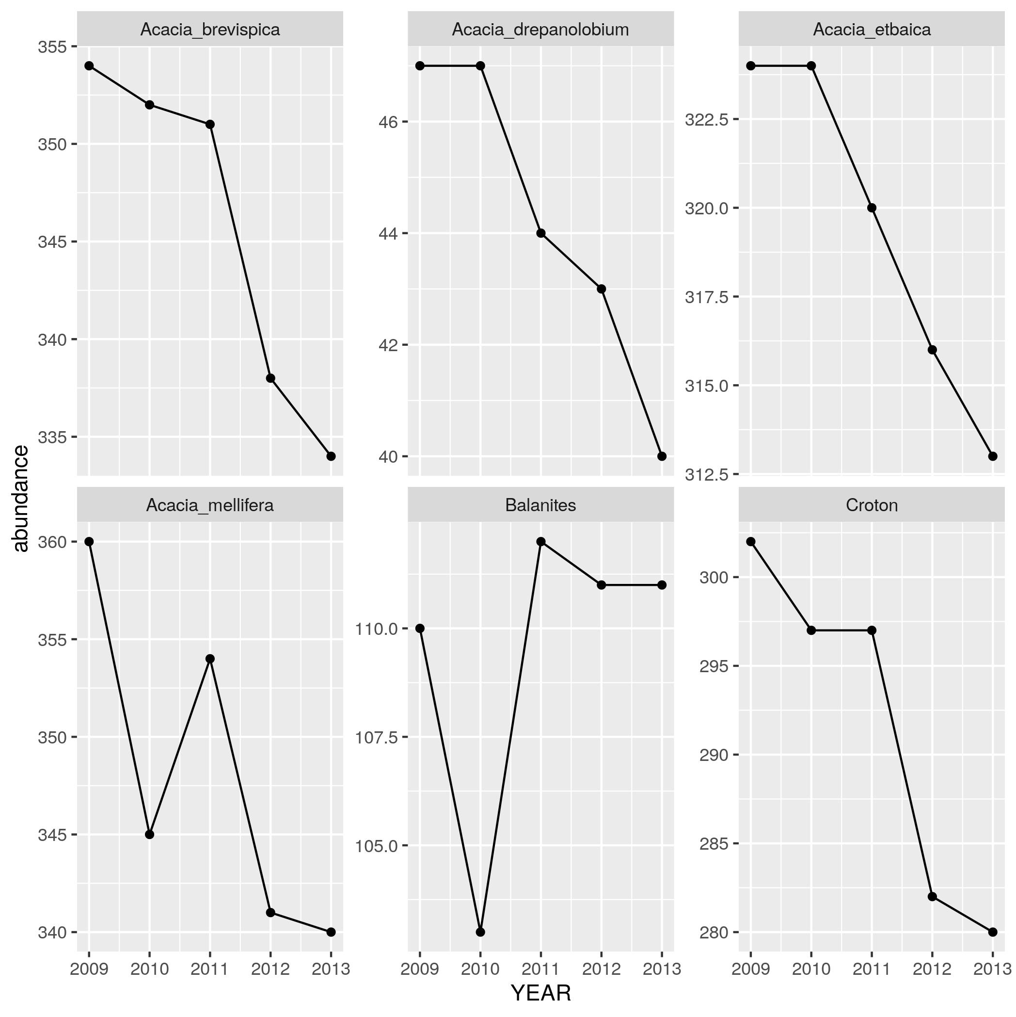
find out how the abundance of each species has been changing through time.
Use
group_by,summarize, andnto make a data frame withYEAR,SPECIES, and anabundancecolumn that has the number of individuals in each species in each year. Print out this data frame. - Using the data the data frame generated in (4),
make a line plot with points (by using
geom_linein addition togeom_point) withYEARon the x axis andabundanceon the y axis with one subplot per species. To let you seen each trend clearly let the scale for the y axis vary among plots by addingscales = "free_y"as an optional argument tofacet_wrap.
- Update the
Graphing Data From Multiple Tables (20 pts)
An experiment in Kenya has been exploring the influence of large herbivores on plants.
Check to see if
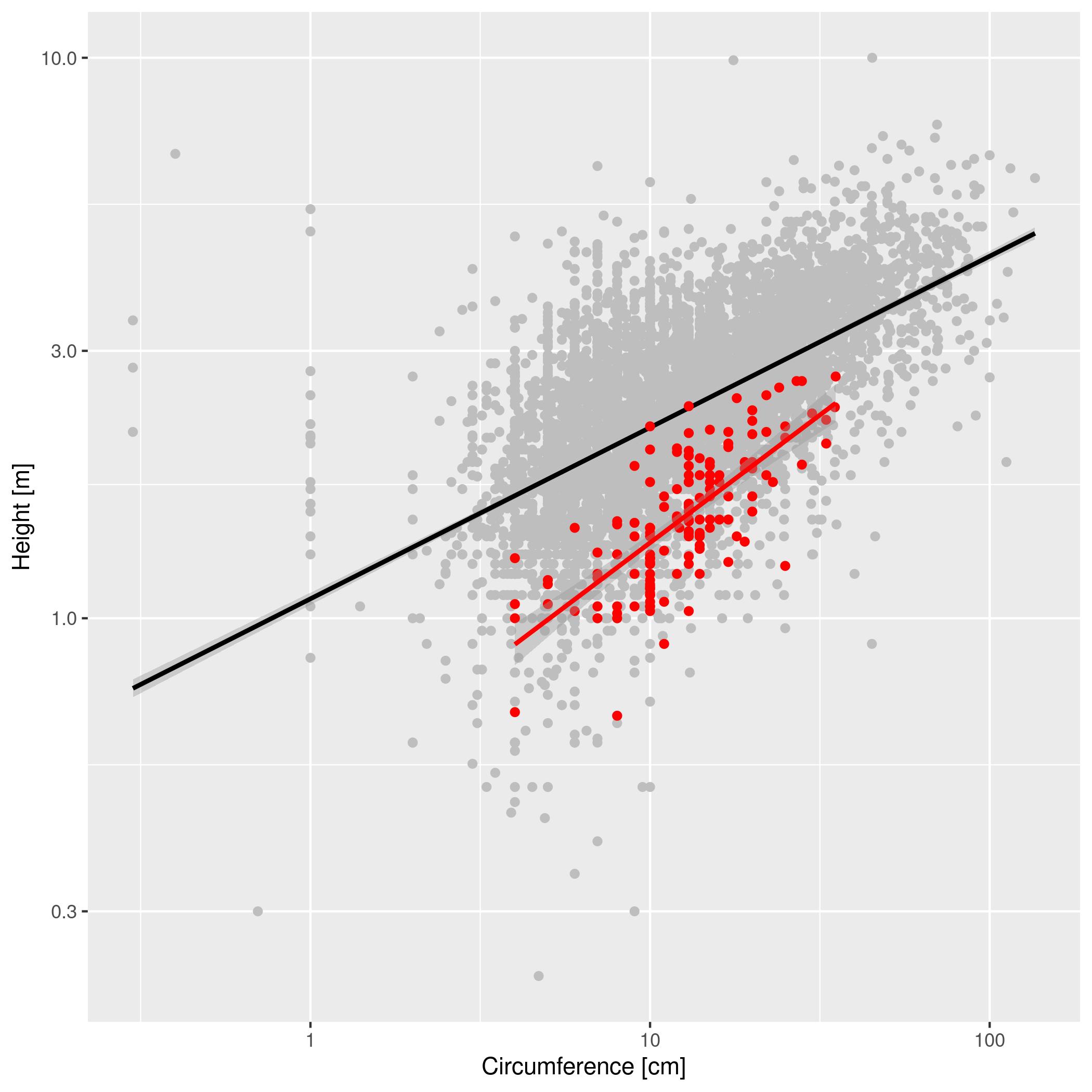
ACACIA_DREPANOLOBIUM_SURVEY.txtandTREE_SURVEYS.txtis in your workspace. If not, downloadACACIA_DREPANOLOBIUM_SURVEY.txtandTREE_SURVEYS.txtInstall thereadrpackage and useread_tsvto read in the data using the following commands:library(readr) acacia <- read.csv("ACACIA_DREPANOLOBIUM_SURVEY.txt", sep="\t", na.strings = c("dead")) trees <- read_tsv("TREE_SURVEYS.txt", col_types = list(HEIGHT = col_double(), AXIS_2 = col_double()))We want to compare the circumference to height relationship in acacia and to the same relationship for trees in the region. These data are stored in two different tables. Make a graph with the relationship between
Expected outputs for Graphing Data From Multiple Tables: 1CIRCandHEIGHTfor the trees as gray circles in the background and the same relationship for acacia as red circles plotted on top of the grah circles. Scale the both axes logarithmically. Inlude linear models for both sets of data. Provide clear labels for the axes.Adult vs Newborn Size (optional)
Larger organisms have larger offspring. We want to explore the form of this relationship in mammals.
Check to see if
Mammal_lifehistories_v2.txtis in your working directory. If not download it it to yourdata/folder. If the above link doesn’t work, you can find the data on the datasets page under Mammal life history.Missing data in this file is specified by
-999and-999.00. Tell R that these are null values using the optionalread.csv()argument,na.strings = c("-999", "-999.00"). This will stop them from being plotted.To read in the data, run the following command:
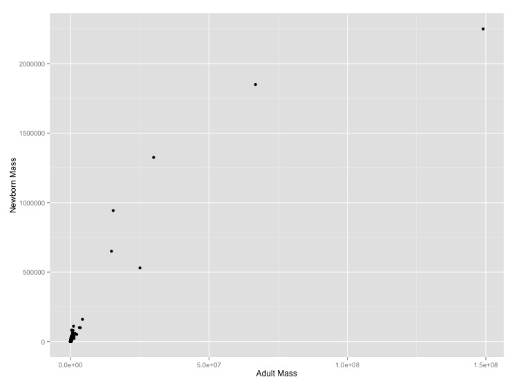
mammal_histories <- read.csv("data/Mammal_lifehistories_v2.csv", na.strings = c("-999", "-999.00"))- Graph adult mass vs. newborn mass. Label the axes with clearer labels than the column names.
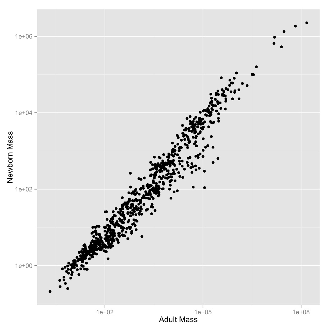
- It looks like there’s a regular pattern here, but it’s definitely not linear. Let’s see if log-transformation straightens it out. Graph adult mass vs. newborn mass, with both axes scaled logarithmically. Label the axes.
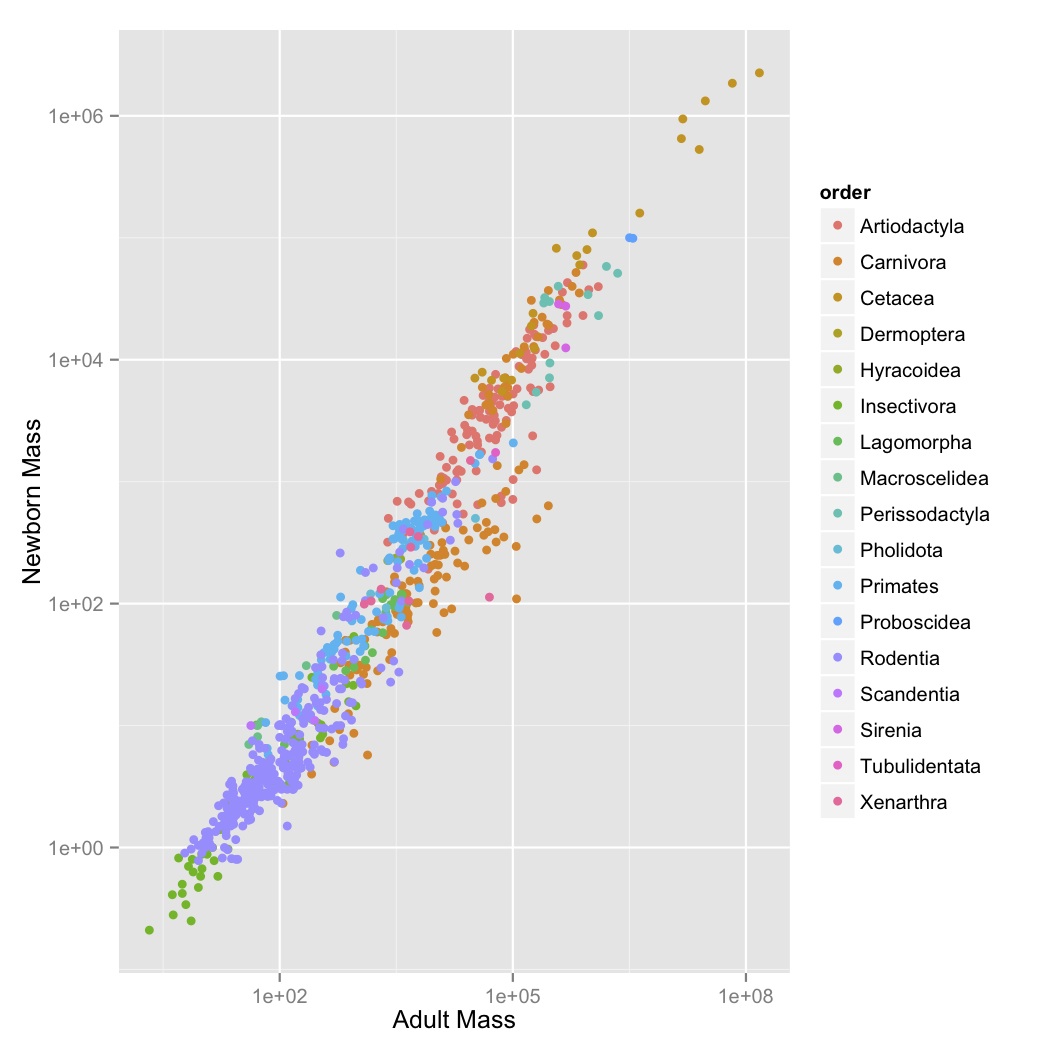
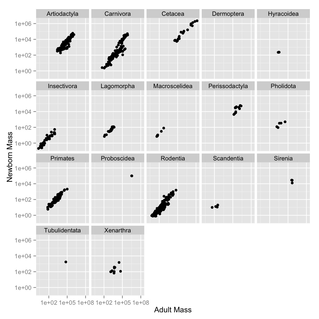
- This looks like a pretty regular pattern, so you wonder if it varies among different groups. Graph adult mass vs. newborn mass, with both axes scaled logarithmically, and the data points colored by order. Label the axes.
- Coloring the points was useful, but there are a lot of points and it’s kind
of hard to see what’s going on with all of the orders. Use
facet_wrapto create a subplot for each order. - Now let’s visualize the relationships between the variables using a simple
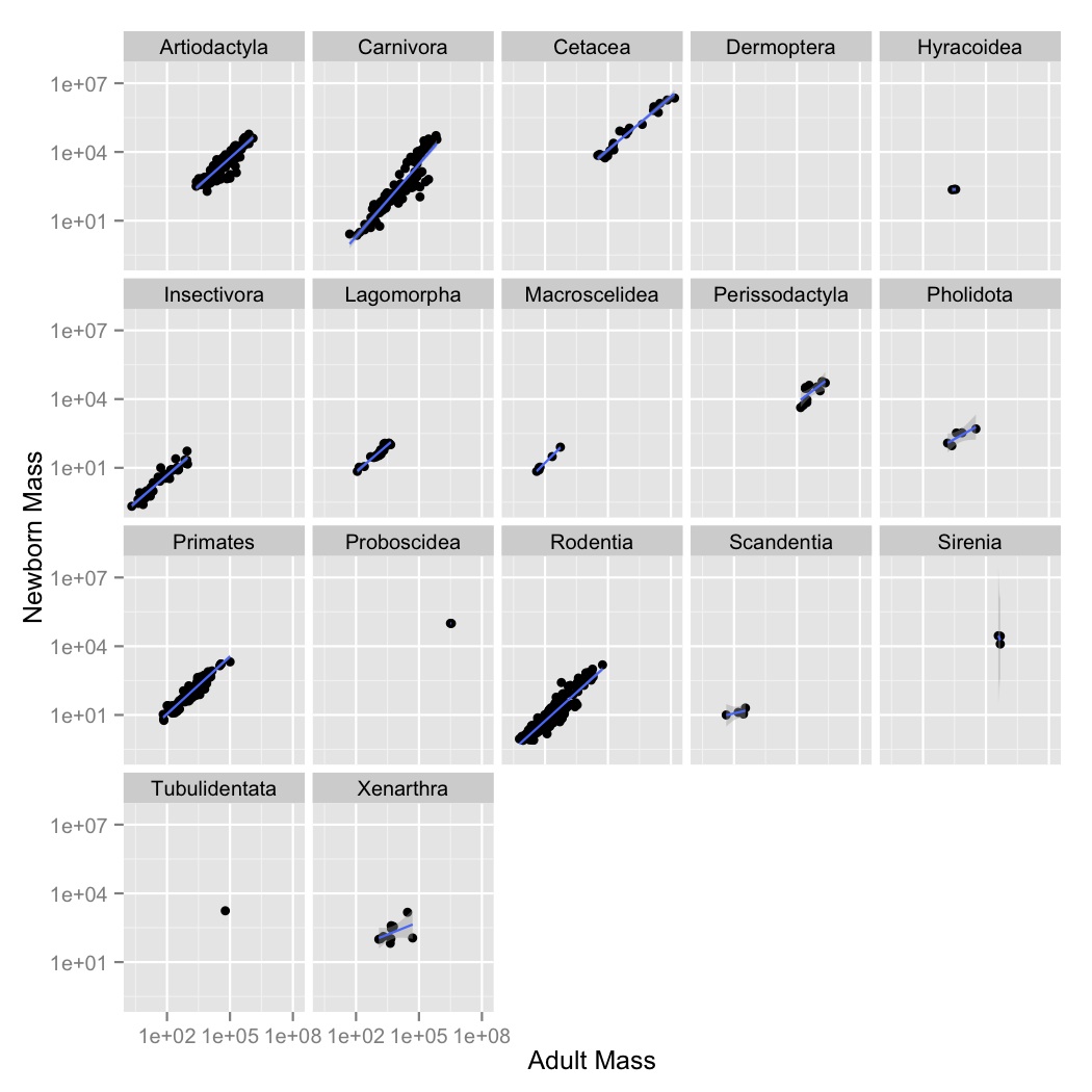
linear model. Create a new graph like your faceted plot, but using
geom_smoothto fit a linear model to each order. You can do this using the optional argumentmethod = "lm"ingeom_smooth.